
Lecture 1. Language, signs and symbols
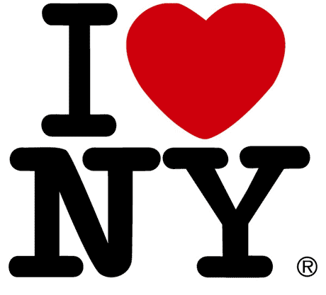
The lecture started with a slideshow that showed us three variations of the famous “I love NY” logo designed by Milton Glaser. The first one had a realistic drawing of a human heart instead of the classic symbol, in the second were used three different fonts, while in the last one the heart was blue instead of red. We were then asked to individuate what was wrong in the logos.


Personally, I found the first logo interesting and original, and if a had to buy a shirt with one of the designs we saw I would have chose it, but some people argued that the design was too complicated and some could find it too realistic, and maybe be disgusted by it. The second one was probably the worst, as the use of many fonts made it look really messy and unprofessional. The last one could be an acceptable variation of the original logo, as the only difference is the color. I don’t think there was anything wrong with it in particular, even thought the variation could make it seem odd.
After this first activity we started talking about language, introducing the topic with a fundamental question: what is language?
For me, it’s a series of sounds and symbols people in the same geographic or cultural area use to communicate. We compared our answers and looked at some definitions:
- “The system of words or signs that people use to express thoughts and feelings to each other”
- “Any one of the systems of human language that are used and understood by a particular group of people”
- “Words of a particular kind”
Then we talked about signs. Everything we see can be though about as a sign, for example a chair can be a sign for sitting. The signs are a convention which we learn; objects, the alphabet or isotypes can be viewed as signs.
Isotype (International System Of Typographic Pictures Education) is “picture language”, a method of showing social, technological, biological and historical connections in pictorial form; it was created in Vienna between 1925 and 1934 by Otto Neurathit and was at first known as the Vienna Method of Pictorial Statistics. Altought Neurath believed that cultures are objective and universal, the meanings of international signs are culturally specific. 
Then we talked about symbols in art history, taking Russia and communism as example.
Lecture 2. Olympic branding
The topic of the second lecture was the application of graphic design elements to Olympic design programmes, and it started examinating some editions of the Olympics.
The 1936 olympics took place in Berlin, Germany, during the Nazist era. Throught the games Hitler tried to prove his theories of Aryan racial superiority, but failed as the most popular hero of the Games was an African-American sprinter and long jumper, Jesse Owens. Hitler sought to deceive the world and celebrate his state with the glamour of the Games. Visual content consisted of formal elements borrowed from antiquity, and a sense of pomp was realised by means of gigantic sports arenas, neoclassical architecture, and the strong colours of red and gold (these colours were in favour with dictators, including Hitler, Franco, and Mussolini.

By the late 1960s the concept of comprehensive design systems had become a reality. Planners realised that comprehensive planning for large organisations and events was not only desirable and functional but necessary. This was particularly true in the case of international events, including world’s fairs and Olympic Games, where an international and multilingual audience had to be directed and informed.

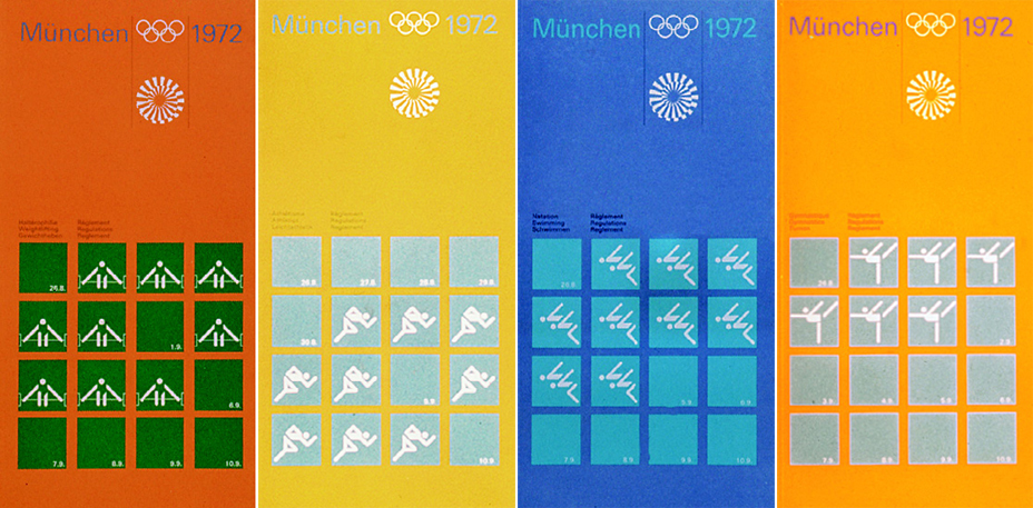
In 1972 the games took place in Munich. Otl Aicher was the art director of this edition and his goal was to eradicate the image of nazism, associating the images of olympics with youth, freshness and peace. They created a friendly, free of politics and peaceful atmosphere, and it was also the first edition with a mascot: “Waldi” the Dachshund.
Aicher argued that normative parameters would ensure freedom in the design process, and that in this respect the design had to be seen as “a game with rules”. He explained:
“As a strictly designed grammar, the system allows free, playful application. The actual figures are figures in a game. That means free figuration of equal elements and fixed rules instead of fixed depiction. This is comparable to ball games or chess, where fixed elements and an agreed set of rules allow playful freedom. This curious balance between obligation and freedom, which is characterised in sport, has its affinity in the area of aesthetics. The choice of our colours is precisely defined, however, we believe we have discovered a whole world of combinations.”
Red was completely removed from the color palette to delete any association with the Nazis and project Germany in a new light. Rejecting the massive scale of the Berlin olympics, Aicher worked with a small number of universal and simple elements that became the building blocks of the visual identity: colour, emblem, type, format and grid. He also developed about one hundred and eighty pictograms about sports activities and support services, such as transportation and medical assistance.
The 1984 Los Angeles summer olympics were marked by non-conformism, eccentricity, audacity and joie de vivre. Rather than resorting to the US’s national colours, Deborah Sussman opted for the colours of the Pacific rim, with hot magenta, vermillion, aqua and chrome yellow playing a major part.

In 2012 the games were hosted by London, and directed by Wolff Olins. They created new pictograms not based on a grid.
PDFS:

Pingback: CTS 23/10/15 | CTS at LCC