Brand busting, Week 6: Semiotics and Coca Cola

This week we talked about semiotics, a discipline defined as the study of signs and symbols and their use or interpretation. Semiotics is an investigation of how meaning is created and communicated within society, and due to its link with culture-specific conventions, it has an important anthropological value.

Our actions and thoughts are governed by a complex set of cultural rules and conventions, and depend on our ability to interpret them instantly. For example, when we see the switch of colour of a traffic light we instinctively know how to react. The reason lies its nature as a sign established by cultural convention that we learn as children; it only requires a deal of unconscious cultural knowledge to understand its meaning.

So, how does semiotics relate to branding?

Even if making the connection is not immediate, it’s easy to see how semiotics is fundamental for a subjects that aims to communicate clearly a brand’s message and values. Different cultures and factors influence people in the way they interpret signs, and for this reason, companies need to consider carefully the use of their symbols, as their meaning is not always universal.

This is particularly relevant in the case of multi-national corporations, which need to take into considerations language barriers and different cultures in their branding strategies.

To explore this topic, during our group activity we took Coca Cola as our case study, and looking through the lens of internationality we tried to identify how does the brand maintains its identity in different countries.

16b18833bece80b1d651e7a76b77c916

We exhaminted the differences in Coca Cola’s packaging around the world, and noticed how the brand is still recognisable even where the original name isn’t present.
We concluded that Coca Cola maintains a coherent identity by using the same graphic elements and values, as you can see in the use of the characteristic curve and color palette.

Talking about differences in packaging, however, even if we don’t consider the additional lens of the international market Coca Cola has rebranded itself countless times, always managing to maintain a constant image, delivering a sense of evolution rater than radical change.

1428426409347
We identified the reason of this phenomenon in the narrative that Coca Cola creates around the product, rather than its direct function as a beverage. As Kim Cramer and Alexander Koene said, “Although we think that decision-making about brands depends strongly on functional benefits, it all comes down to one question: how will this make me feel?”

coke-taste-the-feeling-3

The company’s last campaign “Taste the Feeling” delivers the idea that drinking Coca-Cola is a simple pleasure that makes everyday moments more special. Its strategy leans on the same principles the brand has been sanding for over the last decade, and employs an  universal storytelling with the product at the heart, reflecting both the functional and emotional aspects of the Coca-Cola experience.

In conclusion, Coca Cola is a great example of the use of semiotics in branding, using it to create a narrative that carries the Coca Cola experience over the physical aspect of consuming the product, involving the consumer emotionally.

Brand busting, Week 4: Wot U :-) About?

During the fourth week of our Brand Busting class, we took a field trip to Tate Britain to see Rachel Maclean’s work, in order to talk about the concept of artist branding using her work as a practical example.

Before the visit, by looking at her website and social media it’s easy to identify her style, described as “Seductive and nightmarish, glossy and grotesque”; characterised by the use of humanised cartoonish characters created with make-up, along with emojis, bright colours and the use of green screen and various digital media.

counter-culture-rachel-maclean-baptism-of-clyde-960

As you walk in her exhibition “Art Now: Wot U : – ) About?” you can immediately recognise her style, that she also applied to the space by using pastel colours on walls. The exhibition consists of her most recent film, “It’s What’s Inside That Counts” (2016), along with some prints that feature characters from it.

print4finalnew1

The film is a critique of modern society that focusing on mass consumption and dependence on technology; it parodies social media, advertising and children’s programmes by constantly switching between a fake, overly positive vision of a universe populated by cartoon characters to a sinister, nightmarish version of it.

In the film, a blue-haired, fairy-like celebrity represents data, feeding a desperate crowd with selfies and internet cables until her system is hacked, causing a complete collapse of the society the artist depicts.

rachel-maclean-we-want-data-dye-sublimation-fabric-print-series-2-1-x-3-m-commissioned-by-artpace-and-home-1

Rachel Maclean’s “brand” is well defined and recognisable after just looking at her website. Her playful yet grotesque voice is an unique way to convey her message, a critique to the fake optimistical façade of today’s media that hides the lack of real values, while preaching positivity and inner beauty. Her work is so dense with visuals and at times shocking to have an overwhelming power, leaving you the need to wait for a couple of hours to absorb what you saw, before being able to reflect on the real message.

In conclusion, even if her visual style is not what I personally like I found her message really powerful, and I’m definitely going to keep an eye on her next exhibition.

Brand busting, Week 5: Museum of Brands and Packaging

Today I’ll talk about my visit to the Museum of Brands and Packaging, a must-see for anyone interested in branding and advertising. The museum’s consists in a space for private events, the Consumer Timeline Room, and the time tunnel, on which I’ll focus on today.

The time tunnel shows how society has advanced since Victorian times through a growing range of packaged products, giving an insight on the change in taste and style, along with advance in technology.

Its labels start the journey with an historical introduction in the Victorian time; talking about how as she came to the throne in 1837 the benefits of the industrial revolution were already being felt. The railway system was improving, allowing goods to be transported quickly, and during her reign various inventions improved the quality of transport and communications such as the telegraph, the penny post, the opening of Suez Canal and the use of electricity, that started to be used instead of gas lighting in the streets in the 1880s.

The exhibition shows many different issues of magazines and newspaper from those times, along with other innovative printed products such as jigsaw puzzles and music sheets. Then it switches to showing different products commonly used in the household, from canned food to cleaning products.

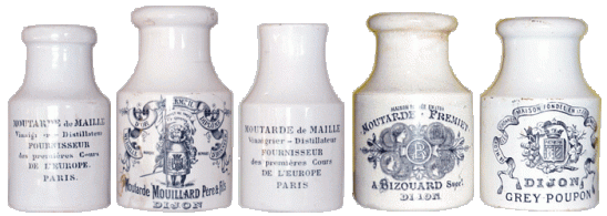
It’s interesting to see how most products with a similar packaging had almost exactly the same branding too, and are nearly indistinguishable from one another. In display you can see how a tin of toothpaste, shaving cream or cold cream are all sold in the same round tin and decorated with the same black and light blue illustration; from far apart you wouldn’t be able to tell the different brand or product.

I noticed the same issue for packagings of cleaning products, food or toys: the differences are minimal, and the illustration style is always the same.

mustardpots

There’s a change at the beginning of WW1, when a new element of patriotism started to prevail as one of the most common means of decoration, as packagings were adorned with allied flags and army leaders. Brands such as Needlers Military Acid Drops and Barker & Dobson’s Tipperary Toffee reflected the political situation, and the sentiments that went along with it.

By 1917 some brands started to save raw materials to help the war effort; for example Cadbury’s cocoa came in card packets rather than in Tins. And when the war was over, to celebrate the victory many brands celebrated with their packagings; for example Ridgeway launched a “Peace” tea canister and Scott & Turner a “Victory” baking powder.

Taste continued to evolve in the 20s, with woman’s fashion taking a new sleek and straight turn, making it fashionable to flatten those parts of the figure that corsets previously accentuated. Along with this change, magazines and packaging started to acquire a new diversity with a wider range of printed colours and illustration styles, with softer, more cartoonish lines in many Childers books and comic strips along with sleeker, straighter female figures in fashion magazines.

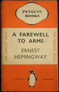
In the 30s a new deco style dominated the modern look, as you can see in any spect of life at the times from cinema, to architecture to home furnishings. The characteristic design of Penguin books covers was launched in 1935.

002

In the 40s, wartime brought new cartoon characters, created to explain life foibles such as gremlins, squander bugs and me chad. Posters encouraged everyone to gig for victory and save fuel.

378980

In the 50s optimism spread with the coronations of queen Elizabeth, occasion for which many British family bought their first tv. Self services supermarkets began to change shopping habits, along with the increased ownership of the refrigerator, food mixers and plastic housewares. The number of cars doubled, and food packagings started to get a clearer branding technique, differentiating each other through the use of characteristic colours and fonts, different styles of illustrations and slogans.

The 60s saw the British pop scene take off, and in the 80s we got closer to the modern world as global communication now created vast audiences for world events, watched by hundreds of millions of people. Technological advance grew amount with awareness for ecological and environmental issues.

In the 90s the World Wide Web opened up endless possibilities for communication, and the internet created what was a new global market.

Brand busting, Week 2: Psychogeographising Branding

During our second week we took a psychogeographic trip of Stratford City’s Westfield shopping centre, to observe the branding techniques of different stores. In one hour, we had the task to enter in some retail outlets of our choice and take notes of our thoughts, feelings and anything pertinent documenting everything through pictures and drawings. We looked at windows display, decorations, the behaviour of the staff, and any other relevant detail taking in consideration voice, message, value, and brand promise.

Once inside Westfield I decided to walk through the whole area before getting in a specific store, to value the overall feel of the shopping centre. After that I walked in a few stores, and took notes of the details mentioned above.

Kiehl’s

The store looked like a pharmacy, and the overall aesthethic made you feel as if the products sold were actual medicines, and not just regular cosmetics. The staff even wore lab coats and near the entrance a skeleton as the ones commonly used in doctors offices, served as decoration.

MAC

The products were beautifully displayed and the shopping assistants were all wearing elaborated makeup, probably to prove their ability as make up artists. Even if the store was really packed, we were asked if we needed help two times.

Lush

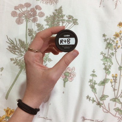
The store is decorated with plants and nature themed elements, and the labels are all hand written. The feeling that the atmosphere gives you is that the products are natural, fresh, and good for you. The staff was really friendly, and when someone approached me I decided to ask her advice about a good hair product. She asked me some questions, than she showed me different products explaining their use and benefits, almost convincing me to buy a mask. When I noticed the price and said that I’d think about it, she gave me a free sample of it.

Processed with VSCO with a4 preset

Apple store

The ambient is airy and open, and makes the store more like a meeting room; feeling accentuated by the big conference-like tables and the absence of visible tills. We played around a few of their products, until we came aross a strange looking cube, that would light up depending on where you touched it. We spent five minutes trying to guess what it was, but nobody came to help us, even if the store wasn’t particularly busy.

After the trip we went back to LCC, chose a store and designed a poster analysing it.

scan011-copia

I choose Lush, as I found it the most interesting experience of the morning, and analysed the brand.

Brand busting, Week 1

Today we introduced the concept of branding, focusing on what it is and how do companies use it to give their brands a strong identity. Essentially, branding is advertising; but it’s also image, and the all the basic principles set as a guideline to give a specific brand a coherent, defined identity.

There are many different types of branding, that can be commercial or not. Corporate branding is related to companies, and can be commercial in the case of companies like Apple, or Nike, or non commercial for non profit companies as Greenpeace. It can also be institutional as in the case of UAL, Tate, or Southwark Council; or be linked to a geographic location for nation branding/civic branding. It can even apply to a public personality as Andy Warhol, The Royal Family, the Dalai Lama, God, Brand Beckham, or the The Beatles; pretty much anything can be branded.

Rob Camper breaks down the definition of branding into 4 components: brand identity or voice (visuals/aesthetics), brand personality or message (anthropomorphised characteristics/traits), brand values (what the brand stands for/believes in) and brand promise (supposed benefits of engagement with brand). Identifying the characterisation and story of the brand gives soul and heart to the brand’s outer shell, and provides an emotional in for the brand’s audience.

Different types of branding techniques are targeted to a different audience: corporate commercial branding is made to appeal consumers, corporate non-commercial branding is for the general public and service user, and civic/nation branding for investors.

Often branding involves the anthropomorphization of a company, an institution or even a person into a “character” with a set of characteristics that people can remember, associating it with a certain logo, colours, and catchprases.

In our first exercise we drew a logo selfie in which we identified all the brands we were wearing, then discusses about what does that say about us; then later we divided in groups and chose a brand, then created a character from it.

scan202

Also we briefly focused on self branding, by creating a logo that represents us. Even if we didn’t have much time for this last exercise, I’m really interested in the idea of self branding and I’m definitely going to explore the concept further and design a real logo.